Technical analysis forex trading forms the foundation of successful currency market analysis, providing traders with systematic methods to study price movements, identify patterns, and make informed trading decisions. Understanding how to read charts, interpret indicators, and recognize market conditions separates profitable traders from those who rely on hope and guesswork.
This comprehensive guide explores everything you need to master technical analysis forex strategies, from foundational concepts to advanced techniques that professional traders use daily.
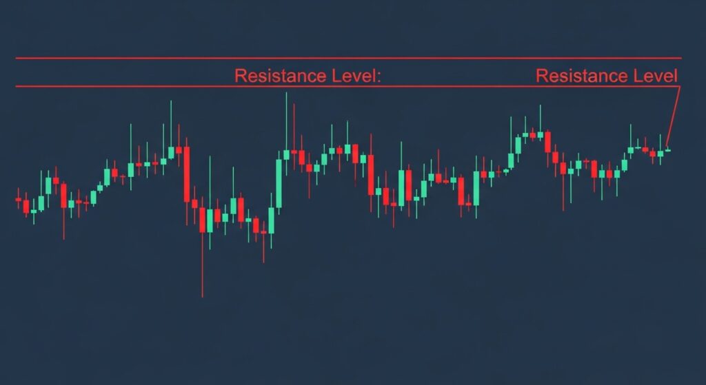
What Is Technical Analysis Forex Trading?
technical analysis forex trading is the study of historical price movements and trading volume to forecast future price direction. Unlike fundamental analysis, which examines economic factors and news events, technical analysis operates on the premise that all known information is already reflected in price.
The discipline rests on three core principles:
Price discounts everything. All fundamental factors—economic data, political events, market sentiment—are already incorporated into currency prices. Charts reveal what the market collectively knows and believes.
Price moves in trends. Markets don’t move randomly but establish directional patterns that persist until significant forces intervene. Identifying these trends early and trading in their direction increases probability of success.
History repeats itself. Market psychology drives price patterns, and human behavior remains remarkably consistent. Chart patterns that worked decades ago continue to appear because traders react similarly to comparable market conditions.
These principles guide how technical traders approach markets. Rather than predicting what should happen based on economic theory, technical analysis reveals what is happening based on actual price behavior.
Why Technical Analysis Matters for Forex Traders
The forex market presents unique characteristics that make technical analysis particularly valuable. With $7.5 trillion in daily trading volume, currency markets offer exceptional liquidity and price transparency. Technical analysis provides several critical advantages in this environment.
Timing precision. Fundamental analysis might correctly identify that a currency should strengthen, but technical analysis determines when to enter and exit positions. A fundamentally sound trade entered at the wrong technical level can result in losses despite being directionally correct.
Universal application. Technical analysis forex in forex trading works across all currency pairs and timeframes. The same principles that identify EUR/USD trends on daily charts apply to GBP/JPY on hourly charts. This consistency allows traders to analyze multiple markets efficiently.
Objective decision frameworks. Emotions destroy trading accounts. Technical analysis provides rules-based systems that remove emotional bias from trading decisions. When a moving average crossover signals an entry, the trader executes without second-guessing or hesitation.
Risk management integration. Technical analysis naturally identifies logical stop-loss placement and profit targets. Support and resistance levels, indicator signals, and chart patterns all suggest specific risk parameters that align trade mechanics with probability.
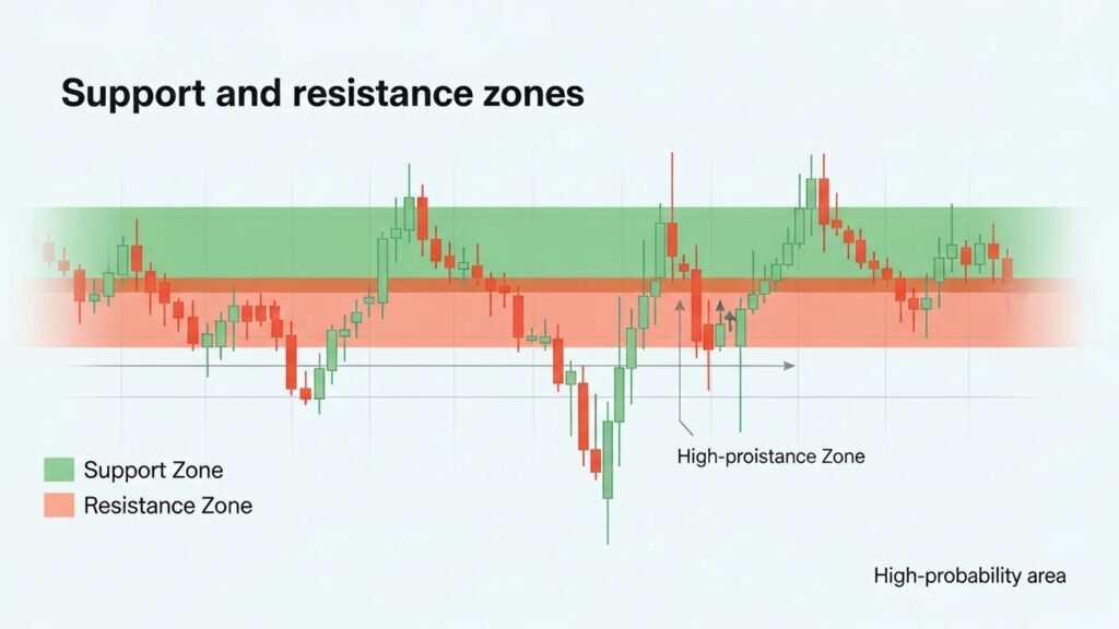
The 24-hour nature of forex markets means price action never stops. Technical analysis provides the tools to monitor and respond to market conditions regardless of when opportunities emerge.
Types of Technical Indicators: Understanding the Categories
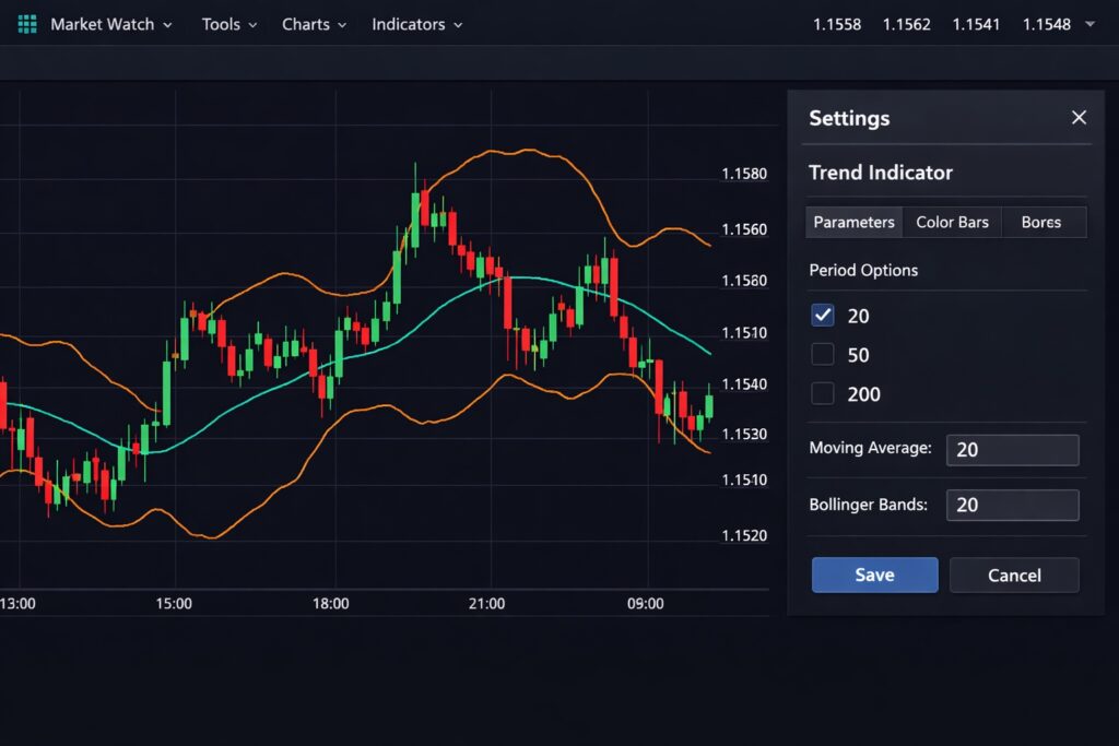
Technical indicators fall into four primary categories, each serving distinct analytical purposes. Understanding these categories helps traders select appropriate tools for specific market conditions.
Trend Indicators
Trend indicators identify market direction and momentum strength. They smooth price data to filter noise and reveal the underlying directional bias.
The most widely used trend indicator remains the moving average, which calculates average price over specified periods. Simple moving averages treat all data points equally, while exponential moving averages weight recent prices more heavily to respond faster to changes.
Moving averages serve multiple functions: identifying trend direction when price trades above or below the average, generating signals when different period averages cross, and providing dynamic support and resistance levels. Our comprehensive moving averages guide explores these applications and demonstrates effective implementation strategies.
Other trend indicators include the Average Directional Index, which measures trend strength without indicating direction, and Parabolic SAR, which provides trailing stop-loss levels that accelerate as trends mature.
Momentum Indicators
Momentum indicators measure the speed of price changes, revealing whether trends are accelerating, decelerating, or potentially reversing. They excel at identifying overbought and oversold conditions that often precede corrections.
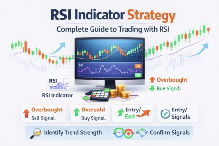
The Relative Strength Index (RSI) stands as the most popular momentum oscillator. RSI compares the magnitude of recent gains to recent losses, producing values between zero and 100. Readings above 70 suggest overbought conditions while readings below 30 indicate oversold markets.
RSI provides multiple trading applications: divergence between price and indicator signals potential reversals, extreme readings identify overextended markets, and centerline crossovers confirm momentum shifts. Traders combine RSI with other indicators to filter false signals and improve accuracy.
The Stochastic Oscillator operates on similar principles but compares current price to its range over a specified period. Like RSI, stochastic identifies overbought and oversold extremes but tends to generate more signals due to its sensitivity.
The MACD (Moving Average Convergence Divergence) combines trend following and momentum characteristics. It calculates the relationship between two exponential moving averages, producing a versatile indicator that identifies trend direction, momentum, and potential reversal points through both line crossovers and histogram analysis.
Volatility Indicators
Volatility indicators measure the rate of price fluctuations, helping traders adjust position sizing and expectations based on current market conditions. High volatility creates larger profit opportunities but carries increased risk, while low volatility suggests consolidation that often precedes significant moves.
Bollinger Bands represent the most recognized volatility indicator. These bands plot standard deviations above and below a moving average, creating a dynamic envelope that expands during volatile periods and contracts when markets quiet.
Bollinger Bands serve multiple purposes: identifying overbought/oversold conditions when price reaches extreme bands, recognizing consolidation through band squeeze patterns, and detecting potential breakouts when price moves outside the bands. The bands also provide natural profit targets and stop-loss levels based on statistical price distribution.
Average True Range measures volatility without indicating direction, calculating the average range between high and low prices over a specified period. Traders use ATR to set stop-loss distances that account for normal market fluctuation, preventing premature exits during routine volatility.
Volume Indicators
Volume indicators analyze trading activity to confirm price movements and identify potential reversals. In forex spot markets, true volume isn’t available since trading occurs across decentralized networks. However, tick volume—the number of price changes per period—serves as a proxy that correlates strongly with actual trading activity.
Volume confirms price trends when increasing volume accompanies price movements in the trend direction. Rising prices on expanding volume suggest genuine buying pressure, while advances on declining volume indicate weak trends vulnerable to reversal.
On-Balance Volume accumulates tick volume, adding volume on up periods and subtracting it on down periods. OBV trends that diverge from price trends often signal impending reversals, as volume leads price in many market transitions.
How to Combine Technical Indicators Effectively
Individual indicators provide valuable insights, but combining multiple tools creates robust trading systems that filter false signals and improve accuracy. Effective combination requires understanding how different indicator types complement each other.
Trend confirmation with momentum. Strong trading opportunities emerge when trend and momentum indicators align. A currency pair trading above its 200-period moving average with RSI above 50 confirms upward momentum supporting the established trend. Conversely, price below the moving average with RSI below 50 validates downward pressure.
Volatility context for entry timing. Bollinger Bands provide context for indicator signals. An RSI oversold reading carries more significance when price reaches the lower Bollinger Band, suggesting genuine exhaustion rather than temporary weakness within a strong downtrend. Band squeeze patterns often precede significant moves, making subsequent MACD crossovers more reliable.
Multiple timeframe analysis. Examining the same indicators across different timeframes reveals the complete market structure. A daily chart uptrend with a 4-hour chart pullback to support creates high-probability long entries when hourly indicators generate bullish signals. This approach aligns trades with the dominant trend while entering at optimal prices.
Divergence confirmation. Divergence between price and indicators provides powerful reversal signals, but false divergences occur frequently. Confirming divergence across multiple indicators—such as both RSI and MACD showing bearish divergence while price makes new highs—dramatically improves reliability.
The key to effective combination lies in using indicators that measure different aspects of price behavior. Combining three momentum indicators adds little value since they’ll generate similar signals. Pairing a trend indicator with a momentum oscillator and a volatility measure creates a comprehensive analytical framework.
Common Technical Analysis Mistakes to Avoid
Even experienced traders fall into analytical traps that undermine their trading performance. Recognizing these common mistakes helps develop disciplined, effective technical analysis habits.
Indicator overload. More indicators don’t improve analysis—they create confusion and conflicting signals. Traders who fill charts with dozens of indicators struggle to make decisions and often freeze when indicators disagree. A simple system with three well-chosen indicators outperforms complex setups with ten.
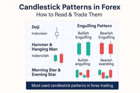
Ignoring price action. Indicators derive from price, making them inherently lagging. Traders who focus exclusively on indicators while ignoring actual price behavior miss critical information. Candlestick patterns, support and resistance levels, and trend lines provide essential context that indicators cannot capture.
Fixed parameter optimization. Default indicator settings work adequately across most markets, but obsessively optimizing parameters to fit historical data creates curve-fitted systems that fail in live trading. RSI works effectively with 14 periods across multiple markets and timeframes. Adjusting it to 11 periods because it tested better on EUR/USD last year likely produces a fragile system.
Neglecting risk management. The best technical analysis cannot overcome poor risk management. Traders who identify perfect setups but risk excessive capital on single trades eventually suffer catastrophic losses. Technical analysis should determine entry and exit points, but position sizing based on account risk ensures long-term survival.
Confirmation bias. Searching for indicators that confirm an existing bias rather than objectively analyzing market conditions leads to selective perception. A trader convinced a currency will rally finds bullish indicators while ignoring bearish signals. Effective analysis requires approaching charts with neutral perspective, accepting what the market reveals rather than forcing predetermined conclusions.
Timeframe mismatch. Trading decisions must align with analysis timeframe. A trader who analyzes daily charts but trades based on 5-minute signals creates conflict between strategic perspective and tactical execution. The analysis timeframe should match the intended holding period—day traders analyze hourly charts while swing traders examine daily and weekly timeframes.
Building Your Technical Analysis Framework
Developing consistent technical analysis skills requires systematic approach and ongoing refinement. New traders benefit from starting simple and gradually expanding their toolkit as competence develops.
Master foundational indicators first. Begin with one indicator from each category: a moving average for trend, RSI for momentum, and Bollinger Bands for volatility. Learn how these tools behave in different market conditions, understanding their strengths and limitations before adding complexity.
Establish analysis routines. Consistent daily or weekly chart review develops pattern recognition skills and market intuition. Professional traders follow structured processes: review higher timeframe trends, identify key support and resistance levels, note upcoming economic events, then drill down to trading timeframe for specific setups.
Document and review trades. Maintaining a trading journal that records technical analysis for each trade creates accountability and reveals patterns in decision-making. Reviewing winning and losing trades identifies which setups work best and which analytical mistakes occur most frequently.
Backtest systematically. Historical chart analysis develops confidence in technical patterns and indicator signals. Scrolling through months of past data while noting how indicators performed trains pattern recognition without risking capital. This homework separates serious traders from casual participants.
Adapt to market conditions. Technical analysis isn’t one-size-fits-all. Trending markets reward trend-following indicators while ranging markets favor oscillators. Skilled traders recognize current conditions and adjust their analytical approach accordingly rather than forcing the same techniques regardless of environment.
For traders focused on automated strategies, our automated forex trading guide explains how technical indicators integrate into algorithmic systems. Expert Advisors execute technical analysis principles systematically, removing emotional interference while maintaining analytical discipline.
Complete Technical Analysis Resource Library
Deepen your technical analysis expertise with these comprehensive guides covering specific indicators and advanced techniques:
Core Indicators:
- Moving Averages Guide: Strategies for Forex Trading – Simple and exponential moving averages, crossover strategies, and dynamic support/resistance applications
- RSI Indicator: Complete Forex Strategy Guide – Overbought/oversold levels, divergence trading, and RSI-based entry systems
- MACD Indicator: Complete Forex Trading Guide – Signal line crossovers, histogram analysis, and trend confirmation techniques
- Bollinger Bands: Proven Forex Trading Strategy – Band squeeze patterns, mean reversion strategies, and volatility-based position sizing
- Stochastic Oscillator: Complete Forex Trading Guide – Fast vs slow stochastics, divergence signals, and overbought/oversold confirmation
Advanced Topics:
- How to Backtest Trading Strategies – Systematic testing methodology to validate technical analysis approaches
- Price Action Trading Basics – Reading naked charts, candlestick patterns, and support/resistance without indicators
Technical Analysis and Risk Management Integration
Technical analysis provides entry signals and profit targets, but effective implementation requires integration with sound risk management principles. The relationship between technical levels and position sizing determines long-term trading success.
Support and resistance levels identified through technical analysis provide logical stop-loss placement. A long position entered at support should exit if price breaks below that level, invalidating the technical setup. This approach creates meaningful stops based on market structure rather than arbitrary dollar amounts.
Indicator-based strategies benefit from volatility-adjusted stops. Using Average True Range to set stop distances accounts for normal price fluctuation, preventing exits during routine volatility while protecting against genuine adverse moves. A stop placed one ATR below entry gives the trade room to breathe while limiting maximum loss.
Profit targets should align with technical levels rather than arbitrary risk-reward ratios. Taking profit at prior resistance makes more sense than exiting at a predetermined distance that may fall short of or overshoot natural price barriers. Technical analysis reveals where other traders will likely act, and profit-taking near those levels captures maximum gain before reversals.
Position sizing based on technical stop distance maintains consistent risk across trades. A setup with a 30-pip stop requires smaller position size than one with a 50-pip stop to risk the same dollar amount. This discipline prevents oversized positions on wide stops that could destroy accounts despite technically sound analysis.
Getting Started with Technical Analysis
Beginning your technical analysis journey requires balancing education with practical application. Theory matters, but chart time develops the pattern recognition and intuition that separate competent analysts from beginners.
Start with a single currency pair—EUR/USD offers exceptional liquidity and responds well to technical analysis. Master identifying trends, support and resistance levels, and basic indicator signals on this pair before expanding to others. Deep expertise on one market exceeds shallow knowledge across many.
Use demo accounts to practice technical analysis without financial pressure. Paper trading allows experimentation with different indicators, timeframes, and strategies while developing confidence in analytical abilities. Track results as seriously as live trading to build discipline and objective self-assessment.
Study past charts systematically. Print historical charts or use replay features in trading platforms to scroll through price action bar by bar. Note how indicators behaved at major turning points, where false signals occurred, and which patterns preceded significant moves. This historical perspective accelerates learning.
Join trading communities focused on technical analysis. Discussing setups with other traders exposes you to different perspectives and prevents analytical blind spots. However, maintain independence—accept input but verify all analysis personally before trading.
Focus on process over profits initially. New traders obsessed with account growth make impulsive decisions and abandon sound analysis during drawdowns. Commitment to following technical rules regardless of short-term results builds the consistency that eventually produces profits.
Final Thoughts on Mastering Technical Analysis
Technical analysis transforms subjective market opinions into objective, rule-based trading decisions. The indicators, patterns, and principles covered in this guide provide the foundation for systematic market analysis that withstands emotional pressure and market volatility.
Success with technical analysis requires patience and persistence. Pattern recognition develops through screen time and experience rather than theoretical study alone. Traders who commit to daily chart review and systematic analysis refinement gradually develop the intuitive understanding that appears effortless but results from dedicated practice.
The most sophisticated technical analysis means nothing without disciplined execution. Following signals consistently, managing risk appropriately, and accepting losses as inevitable components of probability-based trading separates winners from losers. Technical analysis provides the roadmap, but trader discipline determines whether that map leads to destination.
Markets constantly evolve, requiring ongoing adaptation and learning. New patterns emerge, established relationships change, and market structure shifts over time. Technical analysts who continue studying, testing, and refining their approaches maintain edge while those who become complacent find their once-reliable systems degrading.
Begin your technical analysis development today with the resources provided in this guide. Master the foundational indicators, practice on historical charts, and gradually build the systematic approach that transforms market analysis from guesswork into probability-based decision-making.
The path to technical analysis expertise stretches ahead—take the first step by studying one indicator thoroughly this week. Competence builds incrementally through focused effort on specific skills rather than attempting to master everything simultaneously.
Automating Your Technical Analysis
Once you’ve mastered technical analysis strategies, consider automating them with Expert Advisors. Automated trading eliminates emotional decision-making and executes your strategies with perfect consistency 24/7. Our Automated Forex Trading & Expert Advisors: Complete Guide covers everything from MQL4/MQL5 programming to building, testing, and optimizing your own EAs.
Complete Technical Analysis Resource Library
Deepen your technical analysis expertise with these comprehensive guides covering specific indicators and advanced techniques:
Core Indicators:
- Moving Averages Guide: Strategies for Forex Trading – Simple and exponential moving averages, crossover strategies, and dynamic support/resistance applications
- RSI Indicator: Complete Forex Strategy Guide – Overbought/oversold levels, divergence trading, and RSI-based entry systems
- MACD Indicator: Complete Forex Trading Guide – Signal line crossovers, histogram analysis, and trend confirmation techniques
- Bollinger Bands: Proven Forex Trading Strategy – Band squeeze patterns, mean reversion strategies, and volatility-based position sizing
- Stochastic Oscillator: Complete Forex Trading Guide – Fast vs slow stochastics, divergence signals, and overbought/oversold confirmation
- Forex Indicators: Complete Guide – Comprehensive overview of all major indicators, ATR, Fibonacci, Pivot Points, and multi-indicator strategies
- Economic Indicators and Forex: how GDP, inflation, NFP, and central bank data impact currency trading. Master fundamental analysis for better trades
Chart Patterns & Price Levels:
- Fibonacci Trading: Complete Guide for Forex Traders – Retracement and extension levels, golden ratio applications, and Fibonacci-based entries
- Support and Resistance Trading: Complete Guide – Identifying key levels, role reversal concepts, and confluence trading
- Chart Patterns in Forex: Complete Guide – Head and shoulders, triangles, flags, wedges, and pattern-based trading strategies
- Multiple Timeframe Analysis – Analyzing trends across multiple timeframes for higher-probability trade setups
Candlesticks & Price Action:
- Candlestick Patterns: Forex Trading Guide – Japanese candlestick formations, reversal patterns, and continuation signals
- How to Read Forex Charts: Candlesticks Explained – Chart reading fundamentals, timeframe analysis, and visual interpretation
- Price Action Trading: Complete Guide – Advanced price action strategies, swing trading setups, and naked chart analysis
